ShopDreamUp AI ArtDreamUp
Deviation Actions


Suggested Deviants


Suggested Collections


You Might Like…


Description
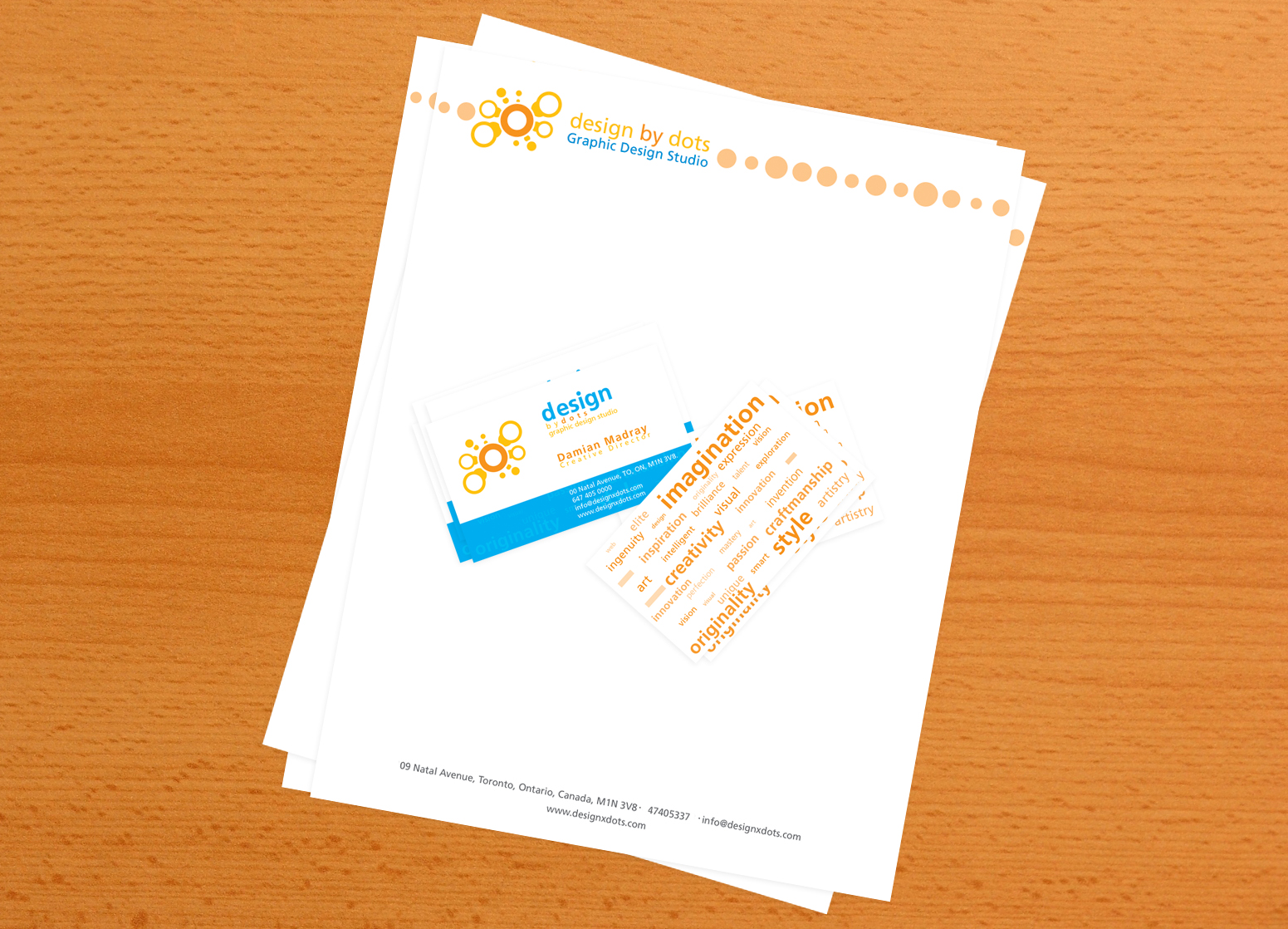
Ahh... so this is the first draft for the corporate design for design by dots.
Last deviation ([link]) I wanted votes on which colour scheme to go with for the logo. So, the one used is the one picked based on my own reasons and poll results.
Some people would be interested in my reasons for picking the colour scheme so here they are:
1. There is great contrast in the colour scheme. What I eventually got to like is in the typography, the word 'design' stood out quite clearly and would be the second thing anyone would see. Despite the fact that it's more contrasting that the logo itself, people always, according to my studies, render shape first, then colour and lastly content.
2. There's more colour to work with in this one which means I have option when designing anything else for it such as corporate, packaging, etc.
3. This reason is somewhat personal. Blue is my favourite colour and in this colour scheme it worked best and if this is going to be something to ID me, then it might as well have a colour that relates to my personality.
4. In my opinion, this colour scheme rocks best.
5. Based on opinon of others, this was the favourite of them all.
Image size
1551x1118px 1020.76 KB
© 2006 - 2024 depthskins
Comments45
Join the community to add your comment. Already a deviant? Log In
very nice work